class: center, middle, inverse, title-slide .title[ # Wrap-up Week 5 + HTML Stuff ] .subtitle[ ## Theming, Fonts, Dashboards, Websites & some CSS ] .author[ ### Maithreyi Gopalan ] .date[ ### Week 6 ] --- layout: true <script> feather.replace() </script> <div class="slides-footer"> <span> <a class = "footer-icon-link" href = "https://github.com/maithgopalan/c2-dataviz-2025/tree/main/static/slides/w6.pdf"> <i class = "footer-icon" data-feather="download"></i> </a> <a class = "footer-icon-link" href = "https://dataviz-win2025.netlify.app/slides/w6.html"> <i class = "footer-icon" data-feather="link"></i> </a> <a class = "footer-icon-link" href = "https://github.com/maithgopalan/c2-dataviz-2025"> <i class = "footer-icon" data-feather="github"></i> </a> </span> </div> --- class: inverse-blue # Data viz in the wild Saratessa Maiko Will ### Maithreyi Gopalan on Deck --- # Agenda * Fonts w/ggplot2 * Flexdashboards + We'll create together, but also skim some slides * Websites w/Distill + Same sort of thing, but also w/deployment * Some customization w/CSS (including fonts) + I think there's a good chance we won't get to this today + If not, we'll come back to this on Week 9 --- class:inverse-blue center middle # Fonts --- # General advice * Match your plot fonts to your text body font -- * Use different fonts to distinguish things + Specifically code + Consider for different heading levels -- * **Always** choose a sans-serif font for code -- * Explore and try - it makes a big impact on the overall look/feel -- * Try not to get sucked into too deep of a rabbit hole --- # {ragg} ``` r #install.packages("ragg") ``` Alternative device to Cairo, png, etc. See the announcement [here](https://www.tidyverse.org/blog/2021/02/modern-text-features/) -- After install, be sure to set *Global Options > General > Graphics* to *AGG* Use with RMarkdown with `knitr::opts_chunk$set(dev = "ragg_png")` -- Will automatically detect fonts you have installed on your computer --- ``` r ggplot(mtcars, aes(wt, mpg)) + geom_point() + labs(title = "Fuel Efficiency of 32 Cars", x = "Weight (x1000 lb)", y = "Miles per Gallon") + * theme(text = element_text(family = "Luminari", size = 30)) ``` <img src="w6_files/figure-html/extrafont-plot-1.png" width="720" /> --- # Support for lots of things! Ligatures and font-awesome icons ``` r ggplot() + geom_text( aes(x = 0, y = 2, label = "x <- y != z"), family = "Fira Code" ) + labs(title = "twitter") + theme( plot.title = element_text( family = "Font Awesome 5 brands" ) ) ``` --- <img src="w6_files/figure-html/unnamed-chunk-5-1.png" width="720" /> --- # emojis ``` r ggplot(mtcars, aes(disp, mpg)) + geom_text(label = "🎉", family = "Apple Color Emoji", size = 10) ``` <img src="w6_files/figure-html/unnamed-chunk-6-1.png" width="720" /> --- # Google fonts https://fonts.google.com * Open source, designed for the web * Good place to explore fonts * Can be incorporated via the `{showtext}` package! --- # {showtext} example ``` r devtools::install_github("yixuan/showtext") library(showtext) font_add_google('Monsieur La Doulaise', "mld") font_add_google('Special Elite', "se") showtext_auto() ggplot(mtcars, aes(disp, mpg)) + geom_point() + labs(title = "An amazing title", subtitle = "with the world's most boring dataset") + * theme(plot.subtitle = element_text(size = 18, family = "se"), * plot.title = element_text(size = 22, family = "mld"), * axis.title = element_text(size = 18, family = "mld"), * axis.text.x = element_text(size = 12, family = "se"), * axis.text.y = element_text(size = 12, family = "se")) ``` --- background-image:url("img/font-change.png") background-size: contain --- # Practice * Create a simple plot * Change the font to something on your computer (e.g., "Arial") * Try importing and using a google font with **showtext** * Try using different fonts for the title and subtitle <div class="countdown" id="timer_f11dad26" data-update-every="1" tabindex="0" style="right:0;bottom:0;"> <div class="countdown-controls"><button class="countdown-bump-down">−</button><button class="countdown-bump-up">+</button></div> <code class="countdown-time"><span class="countdown-digits minutes">05</span><span class="countdown-digits colon">:</span><span class="countdown-digits seconds">00</span></code> </div> --- class: inverse-blue center middle # Why fonts matter ### A few examples of epic fails --- # Megaflicks - LOL .center[  ] --- background-image: url(https://i.redd.it/38jjcgaqu1g11.jpg) --- background-image: url(img/always-mine.png) --- # Quick aside ### Change the font of your R Markdown! Create a CSS code chunk - write tiny bit of CSS - voila! ``` css @import url('https://fonts.googleapis.com/css?family=Akronim&display=swap'); body { font-family: 'Akronim', cursive; } ``` See the CSS slides for more information. --- # Render!  --- # Aside I actually did this for the table slides to make them a bit smaller!  --- # Resource for learning more * I'm not an expert on fonts. I have mostly just picked what looks nice to me. * Consider the accesibility of the font ([good resource here](https://venngage.com/blog/accessible-fonts/)) -- .center[ <img src="https://www.exopermaculture.com/wp-content/uploads/2013/01/alice-falling-down-rabbit-hole1.jpeg" width="475px" /> ] --- Best I've heard of is [practical typography](https://practicaltypography.com) {width="75%"} --- # Identify fonts Use others work to help you - I found the font for these slides from Daniel's theme and he used one that he liked. Use google chrome's developer tools to help! -- Also consider downloading fonts (from google or wherever) and using them directly. Check out this [great blog post](https://yjunechoe.github.io/posts/2021-06-24-setting-up-and-debugging-custom-fonts/) by June Choe. --- class: inverse-red middle # Dashboards! --- # The definitive source! https://rmarkdown.rstudio.com/flexdashboard/ {width="75%"} --- # Example  .footnote[Credit: This example from [Alison Hill's rstudio::conf(2019L) class]()] -- By [Julia Silge](https://juliasilge.com) (see the [blog post](https://juliasilge.com/blog/fatal-shootings/), [dashboard](https://beta.rstudioconnect.com/juliasilge/policeshooting/policeshooting.html), and [source code](https://gist.github.com/juliasilge/9acbe97c549502bac85404779edceba0)) --- {width="75%"} .footnote[Credit: This example from [Alison Hill's rstudio::conf(2019L) class]()] -- By [Jennifer Thompson](https://jenthompson.me) (see the [blog post](https://jenthompson.me/2018/02/09/flexdashboards-monitoring/), [dashboard](https://jenthompson.me/examples/progressdash.html), and [source code](https://github.com/jenniferthompson/MOSAICProgress)) --- # Getting started ``` r #install.packages("flexdashboard") ``` {width="50%"} --- class: inverse-red middle center # Do it ### knit right away ### Add some plots ### Play <div class="countdown" id="timer_e498b361" data-update-every="1" tabindex="0" style="right:0;bottom:0;"> <div class="countdown-controls"><button class="countdown-bump-down">−</button><button class="countdown-bump-up">+</button></div> <code class="countdown-time"><span class="countdown-digits minutes">05</span><span class="countdown-digits colon">:</span><span class="countdown-digits seconds">00</span></code> </div> --- # Columns * Define new column with ``` Column ---------------------------------- ``` * Optionally specify the width with `{data-width}` -- * Annoyingly, be careful with spacing! `{data-width=650}` will work ### but `{data-width = 650}` will not work --- # New squares ### Square title< r code chunk > * Each time you add a square it will split the area evenly among all the squares --- # Thinking in rows * Change the YAML to ```md output: flexdashboard::flex_dashboard: orientation: rows ``` -- * Each `###` will then create a new column -- * Add new rows with ```md Row ---------------------------------- ``` -- * Modify height with `{data-height=XXX}` --- # Pages You can easily specify multiple pages by just specifying a Level 1 Header ```md # Page 1 Column {data-width=650} ---------------------------- ### Chart A < r code> Column {data-width=350} ---------------------------- ### Chart B < r code> ### Chart C < r code> # Page 2 ``` --- # A brief aside on interactivity * Things like `reactable::reactable` and `plotly::ggplotly` can help give your dashboard some nice interactvity. --- # Steps to interactivity ### With multipage layouts Add `runtime: shiny` to your YAML ``` --- title: "My amazing dashboard" runtime: shiny output: flexdashboard::flex_dashboard: orientation: columns vertical_layout: fill --- ``` -- Save your interactive piece into an object, and call the corresponding `render*` fucntion. .pull-left[ ``` r p <- ggplot(...) renderPlotly(p) ``` ] .pull-right[ ``` r tbl <- reactable(...) renderReactable(tbl) ``` ] --- # Sidebar * Julia Silge's had a nice sidebar where she explained things about the flexdashboard... You can have this too! ```md Sidebar Title {.sidebar} -------- Your text here. You can use markdown syntax, including [links](http://blah.com), *italics*, **bolding**, etc. ``` -- * Multiple pages? Just change the separator to keep it there ```md Sidebar {.sidebar} ============ Your text here. You can use markdown syntax, including [links](http://blah.com), *italics*, **bolding**, etc. ``` --- # Tabsets This is actually a standard R Markdown feature, but you can use it with flexdashboards as well ```md Column {.tabset} ---------------------------------------------------------------------- ### Chart 1 < r code> ### Chart 2 < r code> ### Data Table < r code> ``` -- No comma between multiple column arguments .pull-left[ ### Good ``` Column {.tabset data-width=650} ``` ] .pull-right[ ### bad ``` Column {.tabset, data-width=650} ``` ] --- # Icons * Probably not the most important thing, but fun * Use Font awesome! ```md # Years {data-icon="fa-calendar"} ``` --- # HTML Widgets Add a touch of interactivity * Plenty of HTML widgets for R out there (see https://www.htmlwidgets.org/showcase_leaflet.html) * {plotly} is cool ``` r #install.packages("plotly") library(plotly) p <- ggplot(mpg, aes(displ, cty)) + geom_point() + geom_smooth() *ggplotly(p) ``` --- # Including Text * If you want to include text about an overall figure, just put the text in the R Markdown doc like you normally would ```md # Base {data-icon="fa-calendar"} Here's a description about the plot that follows ### A base R plot < r code> ``` --- # What if you have tabsets? * Works great if you want to describe all the plots/tables/content in the tabset * If you want to provide text for an individual plot, use `>` ```md Column {.tabset data-width=350} ------------------- This text will describe the full tabset ### Chart 1 < r code> > Here's some text for Chart 1 ### Table 1 < r code> > Here's some text for Table 1 ``` --- # Storyboarding * A little bit advanced, but pretty cool * First, change the YAML ```md output: flexdashboard::flex_dashboard: storyboard: true ``` --- ```md # Method {.storyboard} ### Sample Descriptives {data-commentary-width=400} < r code> **** This is some text describing what's going on with the sample, and how we moved from the raw data tot he analytic sample. ### Correlation Matrix {data-commentary-width=200} < r code> **** There is less to say here so I made the commentary box smaller # Results {.storyboard} ### Plot 1 {data-commentary-width=600} < r code> **** Lots to say here. There is important ### Plot 2 {data-commentary-width=200} **** Move along ``` --- # Customization * Add font-awesome stuff * Change the [theme](https://rmarkdown.rstudio.com/flexdashboard/using.html#appearance) ```md flexdashboard::flex_dashboard: theme: readable ``` --- # CSS More on this later slides Change the navigation bar to bright pink with thin blue border ```css .navbar-inverse { background-color: #FE08A5; border-color: #0822FE; } ``` --- Save the previous code in "custom.css" then specify in the YAML ```md flexdashboard::flex_dashboard: css: custom.css ``` Making sure "custom.css" is in the same directory as your flexdashboard Rmd. --- # Add a logo and favicon ```md output: flexdashboard::flex_dashboard: logo: logo.png favicon: favicon.png ``` --- class: inverse-red middle # Websites w/Distill --- # Sub-agenda * Introduce Distill * Deployment -- ### Learning objectives * Get at least a basic site deployed -- **By the end of the day! You will have a site!** --- class: inverse-blue middle # Distill https://rstudio.github.io/distill/ --- # Please follow along ``` r install.packages("distill") # or #remotes::install_github("rstudio/distill") ``` --- # Back to RStudio ### Create new project <img src = "img/create-blog.png" height = "350px"> --- # The steps * Create a new RStudio Project * Select distill blog - **Make sure** to Select "Configure for GitHub Pages" <img src = "img/distill-gh-pages.png" height = "350px"> --- # Author a new article * `distill::create_post()` * Create another one! --- # Build your website  --- class: inverse-blue middle # Connect to GitHub ## Use the project-first [workflow](https://docs.github.com/en/actions/writing-workflows/quickstart#introduction) and publish the docs folder .center[ [Demo] ] --- class: inverse-red center middle # That's basically it! 🎉 -- ## A few additional features --- # Categories * You make up the category names. Tag posts with those categories, and they will be linkable ```yaml --- categories: - dataviz - class --- ``` 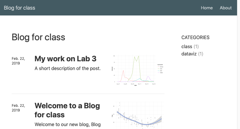{width="75%"} --- # Navigation All controlled with `_site.yml` * Let's add a github logo that links to our repo -- ``` --- navbar: right: - text: "Home" href: index.html - text: "About" href: about.html - icon: fa fa-github href: https://github.com/datalorax/class-site-example --- ``` --- # Create drop-down menus ``` --- navbar: left: - text: "Labs" menu: - text: "Getting Started with R" href: "lab1.html" - text: "Visualizing Distributions" href: "lab2.html" right: - text: "Home" href: index.html - text: "About" href: about.html - icon: fa fa-github href: https://github.com/datalorax/class-site-example --- ``` --- # Base URL Once your site is deployed (or you know the link it will be deployed to), change the `base_url` in the `_site.yml` * Gives some nice sharing features (twitter cards) * Allows you to use [citations](https://rstudio.github.io/distill/citations.html) --- # Drafts If you want to work on a post for a while without it being included in your website, use `draft = TRUE` `distill::create_post("My new post", draft = TRUE)` ``` --- title: "My work on Lab 3" description: | This lab was hard! draft: true --- ``` --- # Figures Change figure options with chunk options * `layout = "l-body"` (default) * `layout = "l-body-outset"` * `layout = "l-page"` * `layout = "l-screen"` + `layout = "l-screen-inset"` + `layout = "l-screen-inset shaded"` ### Try it out! --- # Additional figure options * Rather than using `![]()`, you can use `knitr::include_graphics()` to have the same options. * Use `fig.cap` in chunk options to give nice figure captions. * Note these options should work for tables as well --- # Side notes ``` <aside> This is some text that will appear in the margin - similar to Tufte's style. It is often used to provide extra detail. </aside> ``` -- You can also use this to show small plots ``` <aside> ggplot(mtcars, aes(mpg)) + geom_histogram() + labs(title = "Distribution of Miles Per Gallon") </aside> ``` --- # Customizing the theme Use `distill::create_theme("style")` * Creates a `style.css` file (or whatevs you want to call it in the above) * Modify `_site.yml` to ``` output: distill::distill_article: css: style.css ``` --- * Modify small elements ``` .distill-site-nav { color: rgba(255, 255, 255, 0.8); background-color: #455a64; font-size: 15px; font-weight: 300; } ``` becomes ``` .distill-site-nav { color: rgba(255, 255, 255, 0.8); background-color: #FF5FDD; font-size: 15px; font-weight: 300; } ``` --- # This can be fun! Just be careful not to go too far: from [Yihui](https://slides.yihui.name/2018-blogdown-rstudio-conf-Yihui-Xie.html#33) -- ### Debugging CSS, van Gogh (1890) .center[ <img src="https://slides.yihui.org/images/debug-van-gogh.jpg" height="300px" /> ] --- class: inverse-green middle # Next time ## Back to some more plot refinement; especially working with uncertainty (i.e., standard errors) ## We will come back to more styling of your website/CSS stuff next week also