class: center, middle, inverse, title-slide .title[ # Colors/Themes + Inclusive Design Principles ] .author[ ### Maithreyi Gopalan ] .date[ ### Week 4 ] --- layout: true <script> feather.replace() </script> <div class="slides-footer"> <span> <a class = "footer-icon-link" href = "https://github.com/maithgopalan/c2-dataviz-2025/tree/main/static/slides/w4.pdf"> <i class = "footer-icon" data-feather="download"></i> </a> <a class = "footer-icon-link" href = "https://dataviz-win2025.netlify.app/slides/w4.html"> <i class = "footer-icon" data-feather="link"></i> </a> <a class = "footer-icon-link" href = "https://github.com/maithgopalan/c2-dataviz-2025"> <i class = "footer-icon" data-feather="github"></i> </a> </span> </div> --- # Agenda * Learn about C.R.A.P * Color basics + 3 basic ways color is used * Color blindness * Some common problems with color use * Quick discussion of palettes * Quick discussion of themes * Lab 4 * Q & A with Dr. Daniel Anderson, who pioneered this EDS specialization and class (next week)! --- # Learning Objectives * Learn a bit more about good/inclusive design principles * Understand different types of color palettes + ...and when you should use one versus another * Understand and be able to effectively evaluate concerns related to color blindness * Be able to fluently change colors/fills within ggplot --- # Universal principles * Contrast * Repetition * Alignment * Proximity + Pioneered by [Robin Patricia Williams](https://clueify.com/blog/crap-design-principles/) --- * These design principles apply everywhere! * Graphic design, art, music, architecture… and graphs! --- # Is that gray background okay? ``` r theme_set(theme_gray()) ggplot(mpg, aes(x = displ, y = hwy, color = drv)) + geom_point(size = 2) ``` <img src="w4_files/figure-html/standard-grey-1.png" width="100%" /> ``` r theme(gray) ``` ``` ## Named list() ## - attr(*, "class")= chr [1:2] "theme" "gg" ## - attr(*, "complete")= logi FALSE ## - attr(*, "validate")= logi TRUE ``` + It adds contrast! Some people (including me) just don't like it!!! --- # Applying CRAP to ggplot * We can follow CRAP principles to make big improvements to our plots * Claus Wilke's chapter covers lots of these graph-specific principles * We can apply these principles to ggplot plots --- # Like this! .pull-left[ ``` r library(hrbrthemes) ggplot(mpg, aes(x = displ, y = hwy, color = drv)) + geom_point(size = 2) + theme_ipsum_ps() ``` ] .pull-right[  ] --- # And this! .pull-left[ ``` r library(hrbrthemes) ggplot(mpg, aes(x = displ, y = hwy, color = drv)) + geom_point(size = 2) + theme_modern_rc() ``` ] .pull-right[  ] --- # Or this! .pull-left[ ``` r library(ggthemes) ggplot(mpg, aes(x = displ, y = hwy, color = drv)) + geom_point(size = 2) + scale_color_economist() + theme_economist() ``` ] .pull-right[  ] --- # And even this! .pull-left[ ``` r #remotes::install_github("gadenbuie/ggpomological") library(ggpomological) ggplot(mpg, aes(x = displ, y = hwy, color = drv)) + geom_point(size = 2) + scale_color_pomological() + theme_pomological_fancy() ``` ] .pull-right[  ] --- # One magic, powerful function `theme()` + Depending on time we come back to an anatomy of `theme` the end today or next week! --- # Before we get too deep into themes of which colors is an essential element... ### Some very practical advice about colors * Keep straight when color is mapped to a variable through `aes` and when it's modifying an element overall + Former requires `scale_color_*` or `scale_fill_*` while the latter does not -- * Keep straight colors and fills (see former bullet) -- * Use advice of others to your advantage (e.g., http://colorbrewer2.org/) --- class: inverse bottom center background-image:url(http://socviz.co/assets/ch-01-luminance-contrast-color.png) background-size:contain # Why color choice matters --- class: inverse bottom center background-image:url(http://socviz.co/assets/ch-01-luminance-contrast-bw.png) background-size:contain # Why color choice matters --- class: inverse-red middle # Another quick example .realbig[ .middle[ .center[ [{rayshader}](https://resources.rstudio.com/rstudio-conf-2019/3d-mapping-plotting-and-printing-with-rayshader) ] ] ] --- # 3 fundamental uses of color -- 1. Distinguish groups from each other -- 1. Represent data values -- 1. Highlight --- class:inverse-blue middle # Color as a tool to distinguish --- # Discrete items * Often no intrinsic order -- ### Qualitative color scale * Finite number of colors + Chosen to maximize distinctness, while also be equivalent + Equivalent - No color should stand out - No impression of order --- ###Some Examples  .footnote[See more about the Okabe Ito palette origins [here](https://easystats.github.io/see/reference/scale_color_okabeito.html) ] --- # How do we use them? Imagine we have data like this ``` r popgrowth_df ``` ``` ## # A tibble: 51 × 7 ## region division state pop2000 pop2010 popgrowth area ## <fct> <chr> <fct> <dbl> <dbl> <dbl> <dbl> ## 1 Midwest East North Central Michigan 9938444 9883640 -0.00551 56539. ## 2 Northeast New England Rhode Island 1048319 1052567 0.00405 1034. ## 3 South West South Central Louisiana 4468976 4533372 0.0144 43204. ## 4 Midwest East North Central Ohio 11353140 11536504 0.0162 40861. ## 5 Northeast Middle Atlantic New York 18976457 19378102 0.0212 47126. ## 6 South South Atlantic West Virginia 1808344 1852994 0.0247 24038. ## # ℹ 45 more rows ``` --- # Maybe a plot like this .pull-left[ ``` r ggplot(popgrowth_df, aes(x = popgrowth, y = state)) + geom_col(alpha = 0.9) ``` ] .pull-right[ <!-- --> ] --- # Alternatively, fill by region .pull-left[ ``` r ggplot(popgrowth_df, aes(x = popgrowth, y = state)) + geom_col(aes(fill = region), alpha = 0.9) ``` ] .pull-right[ <!-- --> ] --- # Problem with default palette <!-- --> --- # Alternative: viridis .pull-left[ ``` r ggplot(popgrowth_df, aes(x = popgrowth, y = state)) + geom_col(aes(fill = region), alpha = 0.9) + * scale_fill_viridis_d() ``` ] .pull-right[ <!-- --> ] --- # Revised version <!-- --> --- # The Okabe Ito palette .pull-left[ * From [Color Universal Design](https://easystats.github.io/see/reference/scale_color_okabeito.html) ``` r *library(colorblindr) ggplot(popgrowth_df, aes(x = popgrowth, y = state)) + geom_col(aes(fill = region), alpha = 0.9) + * scale_fill_OkabeIto() ``` ] .pull-right[ <!-- --> ] --- # Okabe Ito for colorblindness <!-- --> --- # How am I checking for colorblindness? * Also part of the **{colorblindr}** package ([here](https://github.com/clauswilke/colorblindr)) + depends on the dev versions of **{colorspace}** and **{cowplot}**, which are useful packages in their own right ``` r #devtools::install_github("wilkelab/cowplot") #install.packages("colorspace", repos = "http://R-Forge.R-project.org") #devtools::install_github("clauswilke/colorblindr") ``` --- # A note on installation Occasionally people have run into issues with the install on the previous slide. If that happens, try `install.packages("colorBlindness")` instead, and use the `cvdPlot` function. (It's just a modified version of `cvd_grid` from *colorblindr*) --- ``` r p <- ggplot(popgrowth_df, aes(x = popgrowth, y = state)) + geom_col(aes(fill = region), alpha = 0.9) + scale_fill_OkabeIto() + * theme_void() # not necessary but I like it *colorblindr::cvd_grid(p) ``` <!-- --> --- class: inverse-orange middle # Colors for continuous values --- # Sequential scale examples  --- # Sequential scales * Which values are larger/smaller -- * How distant two values are from each other -- + Scale must be perceptually uniform across its entire range -- + Similar to an interval scale, but for color -- * Often based on a single .bolder[hue] -- * Multi-hue sequential scales tend to follow gradients in the natural world --- class: inverse-red middle # Common uses of sequential palettes --- # Heatmaps First the data: ``` r hm <- diamonds %>% select(table, price, depth, carat) %>% corrr::correlate() %>% pivot_longer(-term) %>% mutate(name = fct_reorder(name, value), term = fct_reorder(term, value)) hm ``` ``` ## # A tibble: 16 × 3 ## term name value ## <fct> <fct> <dbl> ## 1 table table NA ## 2 table price 0.127 ## 3 table depth -0.296 ## 4 table carat 0.182 ## 5 price table 0.127 ## 6 price price NA ## # ℹ 10 more rows ``` --- ``` r ggplot(hm, aes(name, term)) + geom_tile(aes(fill = value)) + coord_fixed() ``` <!-- --> --- ``` r ggplot(hm, aes(name, term)) + geom_tile(aes(fill = value)) + coord_fixed() + *scale_fill_distiller(palette = "Blues") ``` <!-- --> --- # Change the NA value In any `scale_*` you can change the `NA` value, including to `"transparent"`. ``` r ggplot(hm, aes(name, term)) + geom_tile(aes(fill = value)) + coord_fixed() + scale_fill_distiller(palette = "Blues", * na.value = "#b0bfb0") ``` <!-- --> --- # Use this to our advantage ``` r hm2 <- diamonds %>% select(table, price, depth, carat) %>% corrr::correlate() %>% * corrr::shave(upper = FALSE) %>% pivot_longer(-term) ``` --- ``` r hm2_default <- ggplot(hm2, aes(name, term)) + geom_tile(aes(fill = value), color = "gray70") + coord_fixed() + theme(panel.grid.major = element_blank(), panel.grid.minor = element_blank()) hm2_default ``` <!-- --> --- ``` r hm2_default + scale_fill_viridis_c( * option = "magma", * na.value = "transparent" ) ``` <!-- --> `option = c("viridis", "magma", "inferno", "plasma")` --- # Choropleths ``` r library(tidycensus) library(tigris) options(tigris_use_cache = TRUE) options(tigris_class="sf") #census_api_key("Insert your key", install=TRUE) vars_pl_2020 <- load_variables(2020, "pl") #View(vars) ``` <!-- --> --- # Heat palette .pull-left[ ``` r lane %>% mutate(pct = 100 * (value / summary_value)) %>% ggplot(aes(fill = pct, color = pct)) + geom_sf() + coord_sf(crs = 26915) + theme_dviz_map(font_size = 25, font_family = "Roboto") + scale_fill_continuous_sequential("Heat") + scale_color_continuous_sequential("Heat") + labs(title = "Percentage of people identifying as White", subtitle = "Lane County", caption = "US Census Decennial Tract Data") ``` <!-- --> ] .pull-right[  ] --- # Options * `scale_fill_continuous_sequential("Heat")` * `scale_color_continuous_sequential("Heat")` * `scale_fill_discrete_sequential("Heat")` * `scale_color_discrete_sequential("Heat")` --- # viridis palette <!-- --> --- # Diverging palettes  --- # Earth palette <!-- --> --- <!-- --> --- # Back to our heatmap Use a diverging palette that balances at zero. Notice the transparency is now a bit problematic... ``` r library(colorspace) hm2_default + scale_fill_continuous_divergingx( palette = "Tropic", mid = 0, limits = c(-1, 1), rev = TRUE, na.value = "transparent" ) ``` --- <!-- --> --- # Try a different palette Most diverging palettes have a light gray or white center point. Some have black. Let's try one of those. -- ``` r hm2_default + scale_fill_continuous_diverging( palette = "Tofino", mid = 0, limits = c(-1, 1), rev = TRUE, na.value = "transparent" ) ``` --- <!-- --> -- I don't love it --- # One more try! Back to our last palette, but change the `NA` value to a light gray ``` r hm2_default + scale_fill_continuous_divergingx( palette = "Tropic", mid = 0, limits = c(-1, 1), rev = TRUE, na.value = "gray70" ) ``` --- <!-- --> -- Maybe better? I give up for now... --- # More on colorspace Great package with great documentation. Let's go look! [colorspace](http://colorspace.r-forge.r-project.org/) --- # More diagnostics ``` r our_scale <- diverge_hcl(5, palette = "Tropic", rev = TRUE) demoplot(our_scale, "bar") ``` <!-- --> --- ``` r demoplot(our_scale, "heatmap") ``` <!-- --> --- ``` r demoplot(our_scale, "map") ``` 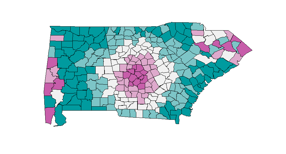<!-- --> --- ``` r demoplot(our_scale, "lines") ``` <!-- --> --- ``` r demoplot(our_scale, "scatter") ``` 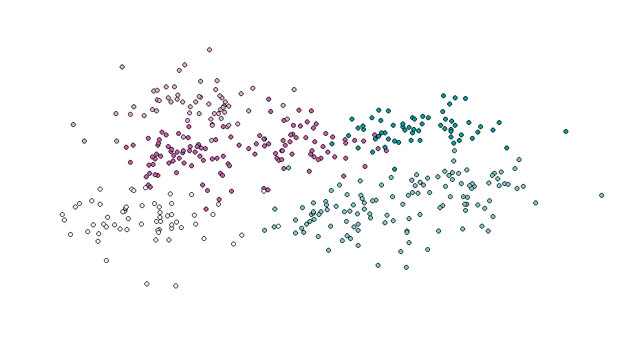<!-- --> --- # Diferent background Note - this is base graphics ``` r par(bg = "gray20", cex = 3, mar = rep(0, 4)) demoplot(our_scale, "scatter") ``` 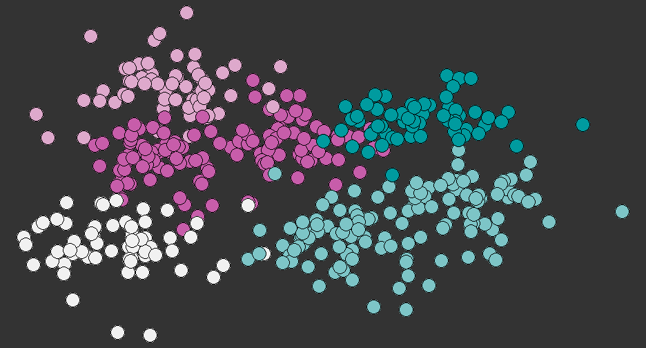<!-- --> --- ``` r hclplot(our_scale) ``` 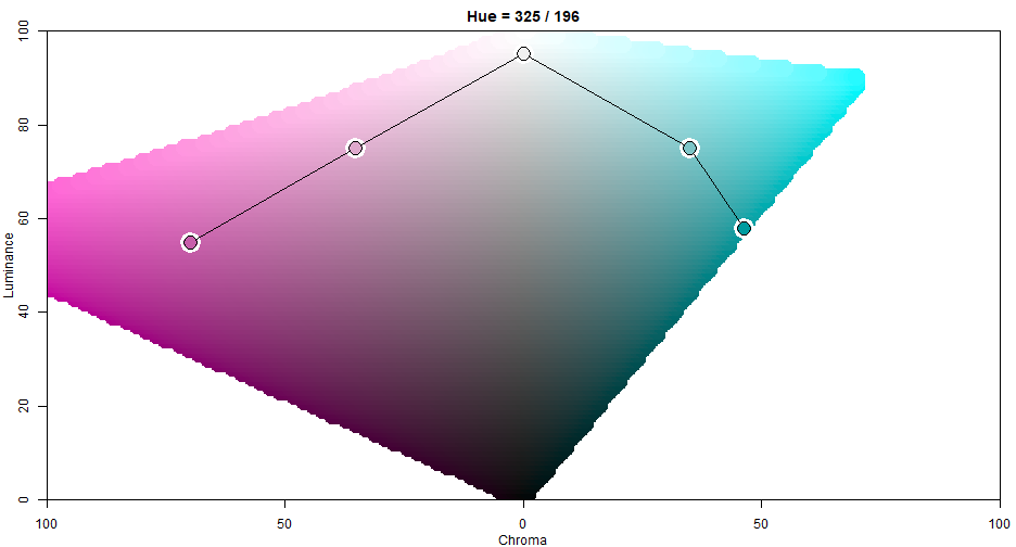<!-- --> --- ``` r specplot(our_scale, type = "o") ``` 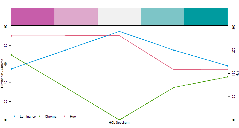<!-- --> --- # Check colorblindness We can check for our palette, in addition to our figure overall ``` r swatchplot("Our palette" = our_scale, cvd = TRUE) ``` 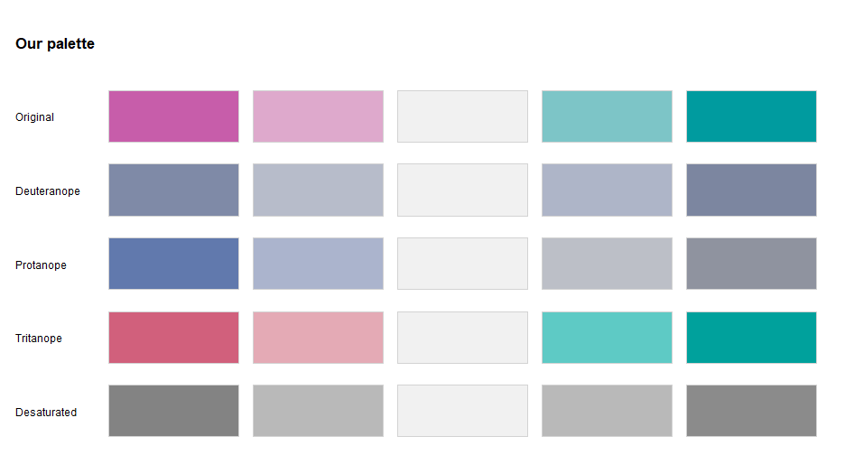<!-- --> --- # Interactivity You can do this all online interactively with the demo plots http://hclwizard.org:3000/hclwizard/ -- ## CVD Emulator online http://hclwizard.org:3000/cvdemulator/ --- class: inverse-blue center middle # Color as a tool to highlight --- # MPG data Basic scatterplot of weight to highway mpg ``` r ggplot(mpg, aes(displ, hwy)) + geom_point() ``` 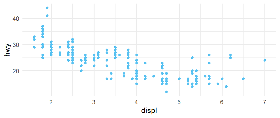<!-- --> --- # Highlight compact cars ``` r ggplot(mpg, aes(displ, hwy)) + geom_point(color = "gray80") + geom_point(data = filter(mpg, class == "compact"), color = "#C55644") ``` 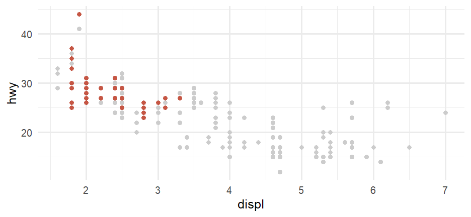<!-- --> --- # Highlight manual cars ``` r ggplot(mpg, aes(displ, hwy)) + geom_point(color = "gray80") + geom_point(data = filter(mpg, str_detect(trans, "manual")), color = "#C55644") ``` <!-- --> --- # Add a legend Couple of different ways - mostly hacky * Pretend you have a column called "compact" ``` r ggplot(mpg, aes(displ, hwy)) + geom_point(color = "gray80") + geom_point(data = filter(mpg, class == "compact"), aes(color = "compact")) + scale_color_manual(values = "#C55644") + theme( legend.title = element_blank(), legend.position = c(0.7, 0.9), legend.box.background = element_rect(colour = "black"), legend.box.margin = margin(t = -0.5, unit = "cm") ) ``` --- <!-- --> --- # Back to our states plot ### Highlight Oregon and Washington ``` r #popgrowth_df <- popgrowth_df %>% # arrange(desc(popgrowth)) %>% # mutate(state = factor(state, levels = state)) ggplot(popgrowth_df, aes(x=popgrowth, y=state)) + geom_col(aes(fill = region), alpha = 0.9) + geom_col(data=filter(popgrowth_df, state == 'Oregon' | state == 'Washington'), fill = NA, color = '#C55644', linewidth = 1, width = 0.9) + # Added width parameter to make it slightly narrower scale_fill_OkabeIto() ``` --- <!-- --> ``` ## List of 1 ## $ axis.text.y:List of 11 ## ..$ family : NULL ## ..$ face : NULL ## ..$ colour : NULL ## ..$ size : num 11 ## ..$ hjust : NULL ## ..$ vjust : NULL ## ..$ angle : NULL ## ..$ lineheight : NULL ## ..$ margin : NULL ## ..$ debug : NULL ## ..$ inherit.blank: logi FALSE ## ..- attr(*, "class")= chr [1:2] "element_text" "element" ## - attr(*, "class")= chr [1:2] "theme" "gg" ## - attr(*, "complete")= logi FALSE ## - attr(*, "validate")= logi TRUE ``` --- # Color labels ``` r states <- unique(popgrowth_df$state) label_color <- ifelse(states == "Oregon" | states == "Washington", "#C55644", "gray30") label_color ``` ``` ## [1] "gray30" "gray30" "gray30" "gray30" "gray30" "gray30" "gray30" "gray30" "gray30" "gray30" "gray30" "gray30" "gray30" "gray30" ## [15] "gray30" "gray30" "gray30" "gray30" "gray30" "gray30" "gray30" "gray30" "gray30" "gray30" "gray30" "gray30" "gray30" "gray30" ## [29] "gray30" "gray30" "gray30" "gray30" "gray30" "#C55644" "gray30" "gray30" "gray30" "gray30" "#C55644" "gray30" "gray30" "gray30" ## [43] "gray30" "gray30" "gray30" "gray30" "gray30" "gray30" "gray30" "gray30" "gray30" ``` ``` r label_face <- ifelse(states == "Oregon" | states == "Washington", "bold", "plain") label_face ``` ``` ## [1] "plain" "plain" "plain" "plain" "plain" "plain" "plain" "plain" "plain" "plain" "plain" "plain" "plain" "plain" "plain" "plain" "plain" "plain" ## [19] "plain" "plain" "plain" "plain" "plain" "plain" "plain" "plain" "plain" "plain" "plain" "plain" "plain" "plain" "plain" "bold" "plain" "plain" ## [37] "plain" "plain" "bold" "plain" "plain" "plain" "plain" "plain" "plain" "plain" "plain" "plain" "plain" "plain" "plain" ``` --- ``` r ggplot(popgrowth_df, aes(x=popgrowth, y=state)) + geom_col(aes(fill = region), alpha = 0.9) + geom_col(data=filter(popgrowth_df, state == 'Oregon' | state == 'Washington'), fill = NA, color = '#C55644', linewidth = 1, width = 0.9) + # Added width parameter to make it slightly narrower scale_fill_OkabeIto()+ theme( axis.text.y = element_text( * color = label_color, * face = label_face ) ) ``` --- <!-- --> --- # Even better ``` r accent_OkabeIto <- palette_OkabeIto[c(1, 2, 7, 4, 5, 3, 6)] accent_OkabeIto[1:4] <- desaturate(lighten(accent_OkabeIto[1:4], .4), .8) accent_OkabeIto[5:7] <- darken(accent_OkabeIto[5:7], .3) gg_color_swatches(7) + scale_fill_manual(values = accent_OkabeIto) ``` <!-- --> --- ``` r ggplot(popgrowth_df, aes(x=popgrowth, y=state)) + geom_col(aes(fill = region), alpha = 0.9) + geom_col(data=filter(popgrowth_df, state == 'Oregon' | state == 'Washington'), fill = NA, color = '#C55644', linewidth = 1, width = 0.9) + * scale_fill_manual(values = accent_OkabeIto) + theme(axis.text.y = element_text(color = label_color, face = label_face)) ``` --- <!-- --> --- # Or even better (imo) ``` r *library(ggtext) ggplot(popgrowth_df, aes(x=popgrowth, y=state)) + geom_col(aes(fill = region), alpha = 0.9) + geom_col(data=filter(popgrowth_df, state == 'Oregon' | state == 'Washington'), fill = NA, color = '#C55644', linewidth = 1, width = 0.9) + # Added width parameter to make it slightly narrower scale_fill_manual(values = accent_OkabeIto) + * scale_x_continuous(expand = c(0, 0)) + labs(title = "Population growth by region", subtitle = "The <span style = 'color: #C55644'>**northwest**</span> is where it's at") + theme(axis.text.y = element_text(color = label_color, face = label_face), * plot.subtitle = element_markdown()) ``` --- <!-- --> --- # One last attempt <!-- --> --- # Back to cars plot We can do this same thing and avoid the legend altogether. ``` r ggplot(mpg, aes(displ, hwy)) + geom_point(color = "gray80") + geom_point(data = filter(mpg, class == "compact"), color = "#C55644") + labs( title = "Cars with bigger engines get lower miles per gallon", subtitle = "<span style = 'color: #C55644'>**Compact**</span> cars typically have small engines" ) + theme(plot.subtitle = element_markdown()) ``` --- <!-- --> --- class: inverse-blue # Data viz in Wild Erick Emily ### Saratessa and Sophia on deck --- # Last example ``` r data(sleepstudy, package = "lme4") head(sleepstudy) ``` ``` ## Reaction Days Subject ## 1 250 0 308 ## 2 259 1 308 ## 3 251 2 308 ## 4 321 3 308 ## 5 357 4 308 ## 6 415 5 308 ``` --- # Plot by subject ``` r ggplot(sleepstudy, aes(Days, Reaction, group = Subject)) + geom_line() ``` <!-- --> --- ``` r *library(gghighlight) ggplot(sleepstudy, aes(Days, Reaction, group = Subject)) + geom_line() + *gghighlight(max(Reaction) > 400) ``` <!-- --> --- ``` r library(gghighlight) ggplot(sleepstudy, aes(Days, Reaction, color = Subject)) + geom_line() + gghighlight(max(Reaction) > 400) + *scale_color_OkabeIto() ``` <!-- --> --- ``` r library(gghighlight) ggplot(sleepstudy, aes(Days, Reaction, color = Subject)) + geom_line() + *facet_wrap(~Subject) + gghighlight(max(Reaction) > 400) + scale_color_OkabeIto() ``` <!-- --> --- # Highlighting The [gghighlight]() package is really neat, but I have had issues with it in the past. If you have troubles, you can always create them more manually has we did previously --- # Example This is a little tricky. First, create a subset of the data that only has the cases you want to highlight ``` r # filter high <- sleepstudy %>% filter(Reaction > 400) %>% select(Subject) # highlight dataframe hl <- semi_join(sleepstudy, high) ``` --- Next, create the background data. We usually just *drop* the faceting column, but in this case we still need the id, so we'll rename it. ``` r # rename facet column; use for grouping bg_data <- sleepstudy %>% rename(id = Subject) ``` --- Finally, plot the highlight data, adding a layer with the background data ``` r ggplot(hl, aes(Days, Reaction)) + geom_line( * aes(group = id), color = "gray80", * data = bg_data ) + geom_line( aes(color = Subject) ) + facet_wrap(~Subject) ``` --- <!-- --> --- class: inverse-red middle # Very quick aside You can do this with any data - a great alternative to stacked histograms. --- # Standard faceted histogram ``` r ggplot(diamonds, aes(depth)) + geom_histogram(aes(fill = cut)) + facet_wrap(~cut) + guides(fill = "none") # drop legend ``` <!-- --> --- # Add a background layer ``` r ggplot(diamonds, aes(depth)) + geom_histogram( * data = select(diamonds, -cut), * fill = "gray80" ) + geom_histogram(aes(fill = cut)) + facet_wrap(~cut) + guides(fill = "none") # drop legend ``` --- <!-- --> --- class: inverse-blue center middle # A few other things to consider --- # Double encodings <!-- --> -- This plot is less than ideal. Why? --- # Color blindness <!-- --> --- # Better version 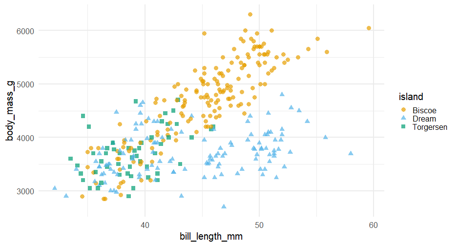<!-- --> --- # Color blindness check 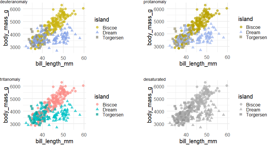<!-- --> --- class:inverse-blue center middle # Common problems with color --- # Too many colors More than 5-ish categories generally becomes too difficult to track ``` r ggplot(popgrowth_df, aes(pop2000, popgrowth, color = state)) + geom_point() ``` 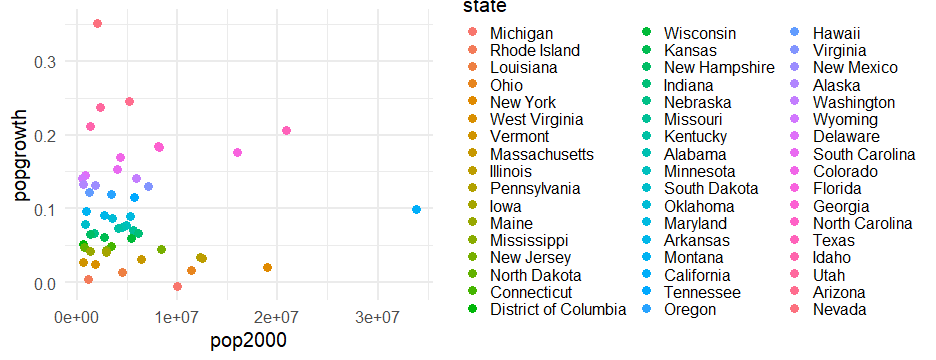<!-- --> --- # Use labels More than 5-ish categories generally becomes too difficult to track ``` r *library(ggrepel) ggplot(popgrowth_df, aes(pop2000, popgrowth)) + geom_point(color = "gray70") + *geom_text_repel(aes(label = state)) ``` 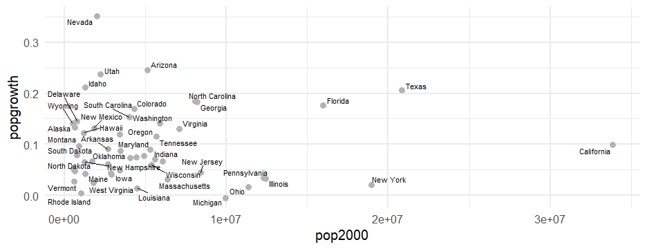<!-- --> --- # Better Get a subset ``` r to_label <- c("Alaska", "Arizona", "California", "Florida", "Wisconsin", "Louisiana", "Nevada", "Michigan", "Montana", "New Mexico", "Pennsylvania", "New York", "Oregon", "Rhode Island", "Tennessee", "Texas", "Utah", "Vermont") subset_states <- popgrowth_df %>% filter(state %in% to_label) ``` --- ``` r *library(ggrepel) ggplot(popgrowth_df, aes(pop2000, popgrowth)) + geom_point(color = "gray70") + *geom_text_repel(aes(label = state), * data = subset_states, * min.segment.length = 0) ``` <!-- --> (still lots more cleaning up we could do here...) --- # Rainbow palette ``` r rainbow(3) ``` ``` ## [1] "#FF0000" "#00FF00" "#0000FF" ``` ``` r rainbow(7) ``` ``` ## [1] "#FF0000" "#FFDB00" "#49FF00" "#00FF92" "#0092FF" "#4900FF" "#FF00DB" ``` --- # Pretty! Doesn't work well See [here](https://www.poynter.org/archive/2013/why-rainbow-colors-arent-always-the-best-options-for-data-visualizations/) for one (of many) articles on why this is the case .pull-left[ ``` r ggplot(popgrowth_df, aes(x = popgrowth, y = state)) + geom_col(aes(fill = state)) + scale_fill_manual(values = rainbow(51)) + guides(fill = "none") ``` <!-- --> ] .pull-right[  ] --- # Last few notes on palettes * Do some research, find what you like **and** what tends to work well * Check for colorblindness * Look into http://colorbrewer2.org/ + `scale_color_brewer()` and `scale_fill_brewer()` ship with ggplot2 --- # For example ``` r ggplot(popgrowth_df, aes(x = popgrowth, y = state)) + geom_col(aes(fill = region), alpha = 0.9) + * scale_fill_brewer(palette = "Set2") ``` --- <!-- --> --- # Paleteer package .center[ [](https://github.com/EmilHvitfeldt/paletteer) ] --- class: inverse-red middle # The anatomy of a `ggplot()` theme --- # Theme system  .footnote[ By [Henry Wang](https://henrywang.nl/ggplot2-theme-elements-demonstration/) ] --- # Theme elements * Each element in the plot can be targeted -- * Plot title = `plot.title` -- * Grid lines = `panel.grid` -- * Legend background = `legend.background`] --- # Theme functions * Use special functions to manipulate specific elements -- * Text-based things = `element_text()` -- * Rectangular things (backgrounds) = `element_rect()` -- * Line-based things (axis lines, grid lines) = `element_line()` -- * Disable element completely = `element_blank()` --- # How to learn `theme()` * The `theme()` function has **94** possible arguments(!!!) * You can get hyper-specific with things like `axis.ticks.length.x.bottom` * The only way to learn how to use `theme()`<br>is to use it and tinker with it --- class: inverse-red middle # Review Lab 3 --- class: inverse-green middle # Lab 4 --- class: inverse-blue middle # Q & A with Dr. Daniel Anderson next week --- class: inverse-green middle # Next time More colors, themes, refinement of plots